Orion Branding Project
I was tasked with creating a company, logo, brand identity, and package design. The company that I created was Orion. A PC and smartphone accessory maker focusing on the often neglected non-Apple side of the electronics market.
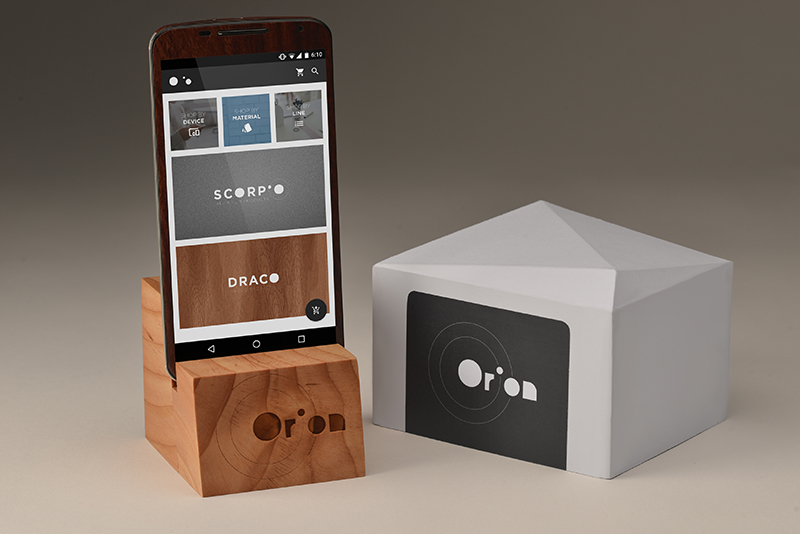
The photograph features the packaging, a product, and an app mockup. I wanted the brand to be classy with an emphasis on geometry. The box's polygonal top was my way of adding interest to something that can be quite mundane. The use of natural materials on the phone stand reflects the company's focus on quality materials.
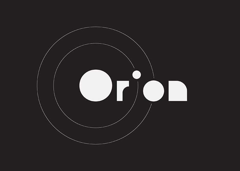
For the logo itself I wanted something astronomically themed while remaining simple and clean. The orbiting effect of the letters adds visual interest and uniqueness.
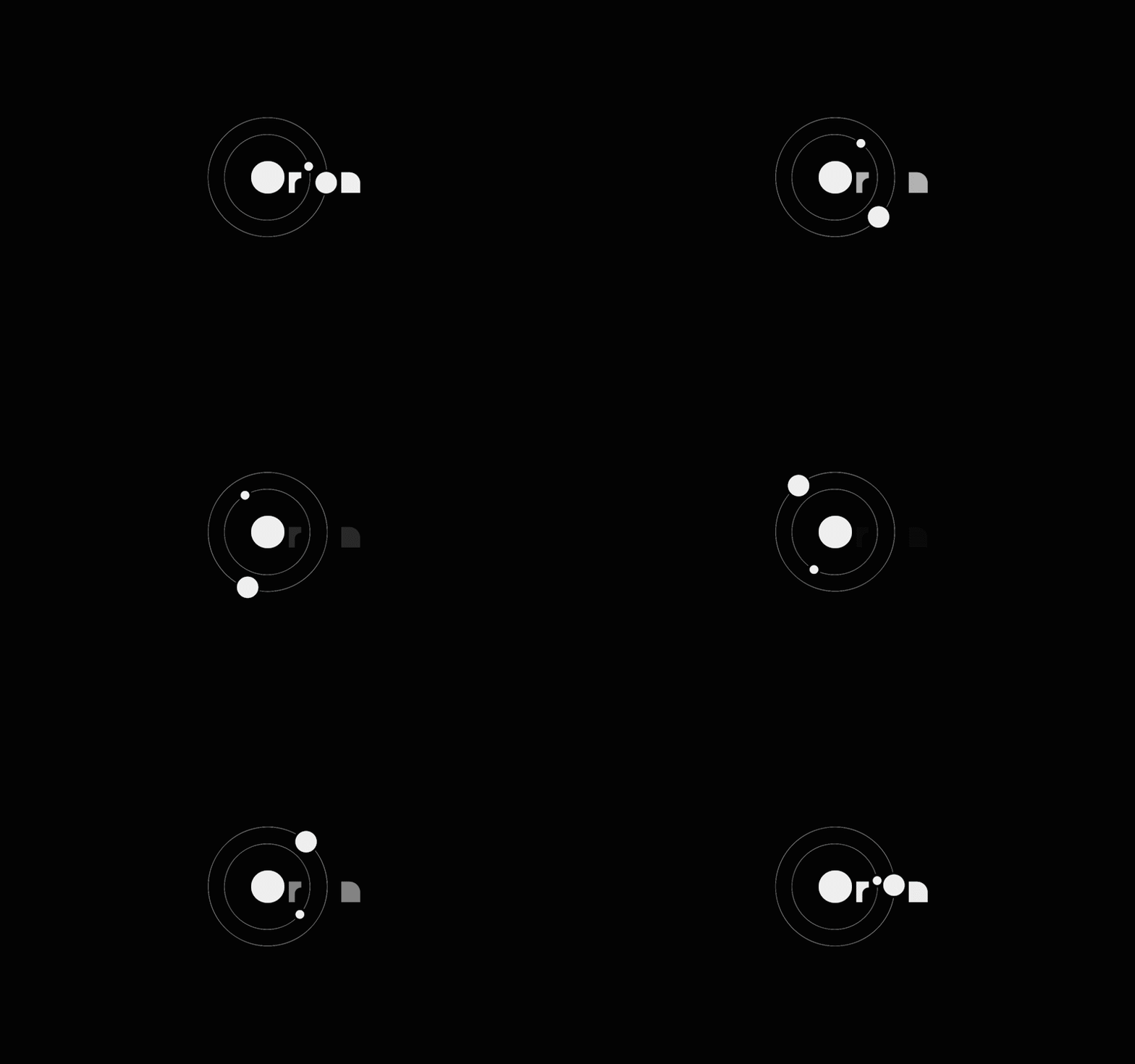
Next is a loading animation for the digital presence of the company. This could appear on the website, mobile applications, etc. The animation ties into the orbiting planet visuals.
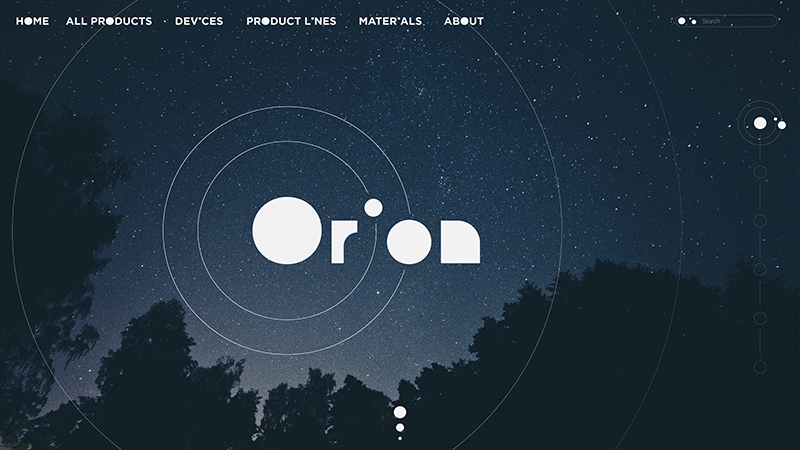
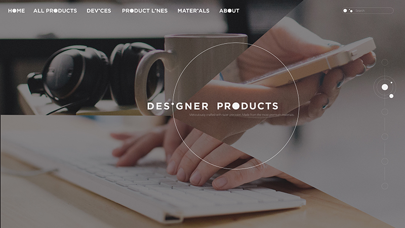
The next two images depict what the orion website could look like. It features a stylized type for the navigation and headings that match the motif of the logo. The visual language is further spread to more of the page such as the "scrollbar" along the right side of the image.
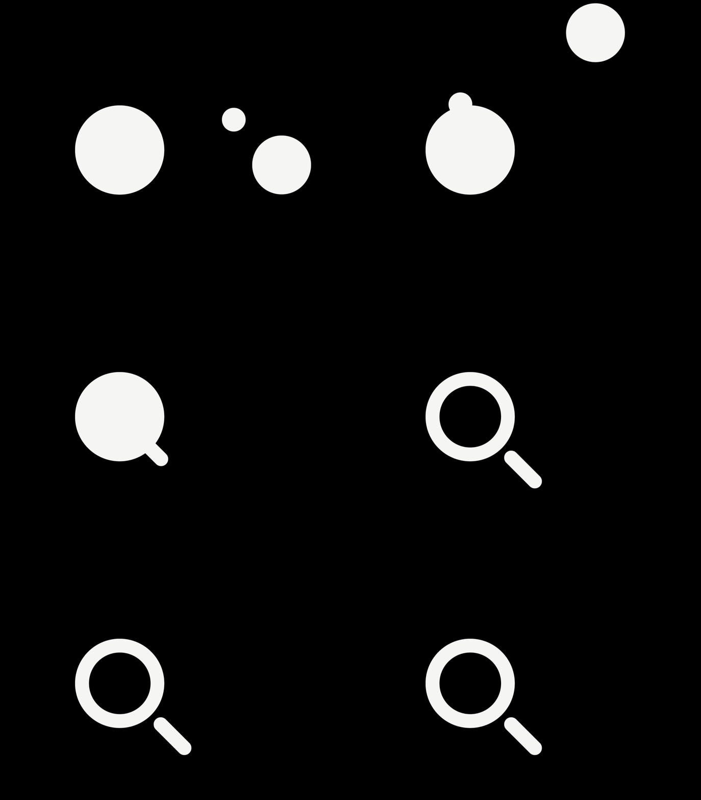
The next image would exist on the webpage as well. The animation that would appear when the search dialogue is clicked. The three circles from the logo combine to morph into a magnifying glass.
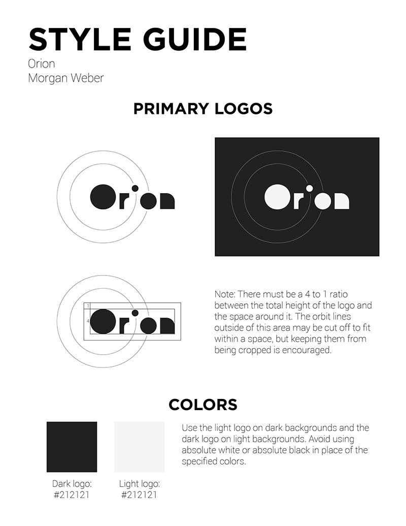
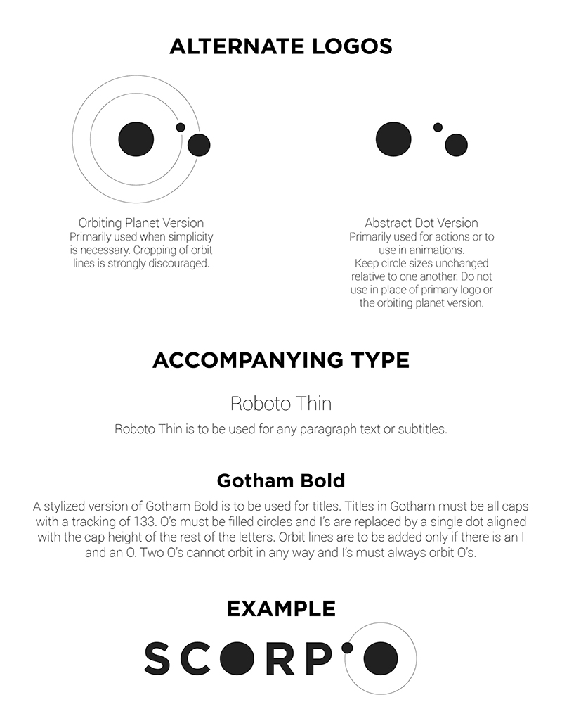
The remaining images depict the style guides I have created for the brand as well as alternate logos that could be used for different situations.
