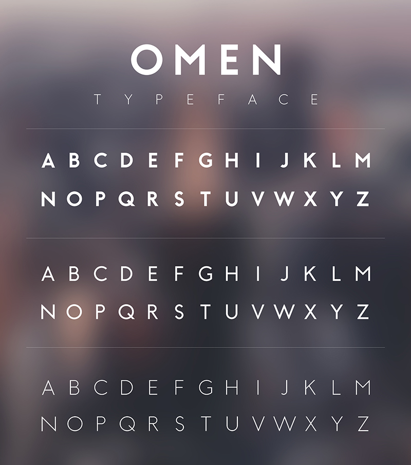
Omen Typeface
I never seem to get quite enough geometry in the typefaces I use consistently so Omen is my response. I wanted to create an incredibly geometric typeface and I have done so here with Omen. The angles of every letter are based largely on 45 degree angles and smaller divisions of 45 such as half (22.5), and a quarter (11.25).
My other goal was to create a typeface that shared attributes of fonts with pointed corners and ones with rectangular corners. My solution was to create the letter as if it were going to have a pointed tip then trim it to a semi-sharp rectangular corner. This creates a sharp look withouth having a perfectly pointed tip that juts out far beyond the baseline and cap height.
My other goal was to create a typeface that shared attributes of fonts with pointed corners and ones with rectangular corners. My solution was to create the letter as if it were going to have a pointed tip then trim it to a semi-sharp rectangular corner. This creates a sharp look withouth having a perfectly pointed tip that juts out far beyond the baseline and cap height.
