Logo Collection
Unbeaten Travel: The company name comes from the phrases "off the beaten path" or "unbeaten path," implying a sense of adventure and nonconformity. The decision to have a combined U and N comes from this rebellious nature of the phrase. I can imagine it being paired with other words like "un-conventional."
Goshawk Drones: After researching drones and developing drone logos, the client and I decided to shift our approach and pursue designs involving goshawks. The birds had some wonderful features and this logo was developed while referencing the actual birds. The design is primarily made through the combining of circular forms which lends itself to the dynamism achieved.
Ida-Lew Economic Development Council: Ida-Lew provides economic development services to businesses within Idaho and Lewis counties. It was important to the client to call out both of these counties in the logo. The logo design was developed with this need in mind. The shape of Idaho is used as a tool to give the highlighted counties some additional context.
Vu Tommy Tran: This logo was designed to be a decorative wordmark of the client's initials. The stylized Torii gate nestled into the V creates a primary and secondary T to achieve that goal.
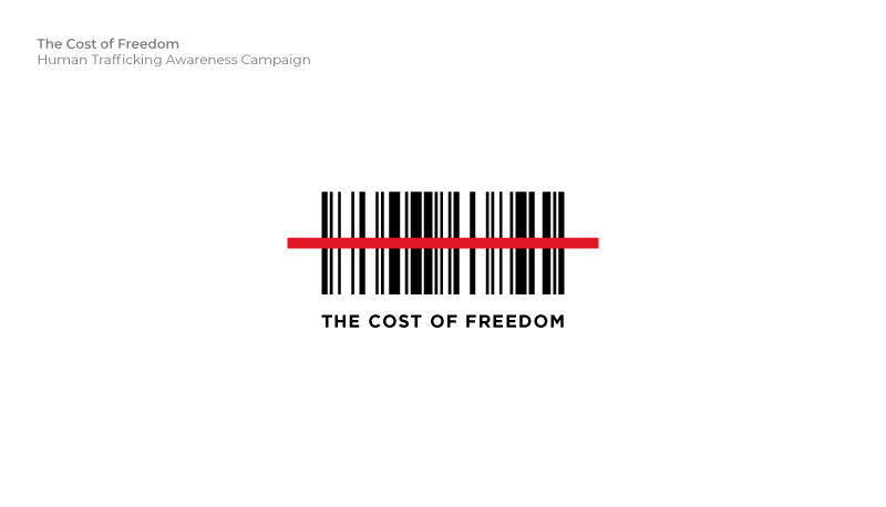
The Cost of Freedom: This logo was created as part of a fundraising effort for The Cost of Freedom, a human trafficking awareness group. TCOF was producing a video on human trafficking in Idaho and this design was to be used to garner awareness and support. The idea of a barcode with a cross through it was to denote that humans are not for sale. The barcode in this logo spells out "human" in Code 128.
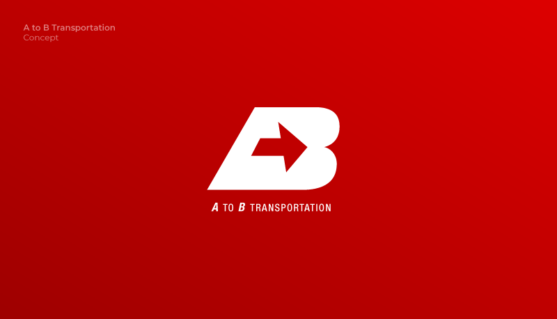
A to B Transportation:For this logo I wanted to imply the phrase "A to B" in the simplest and cleanest way that I could. I also wanted to portray a feeling of motion or speed. When I started I tried to use the whole phrase but nothing was attractive or simple enough. After many iterations of simplification I was able to combine the A, the arrow, and the B using implied lines and negative space. It was a challenge to preserve the A, but I was able to do so by having the vertical line of the arrow follow the right edge of the A. The horizontal line of the arrow helps establish the A's counter.
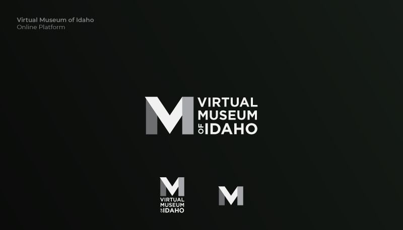
Virtual Museum of Idaho:For the Virtual Museum of Idaho I wanted to make a logo that was succinct. Something that didn't have to be complex or ornate, but still had plenty of meaning. My approach was to combine all three letters of the name (V, M, & I) into one. The V and the M, being the most important of the three were made to stand out most. The M, being the silhouette, was naturally visible. I chose to make the V the brightest color in order to highlight its significance.
