Impact Group Rebrand
Impact Group was looking to revamp many of its visuals to keep their brand feeling fresh. The primary task was to update the company's service icons and other supporting visuals. They weren't carrying out a full rebrand, it was more of a reinterpretation of the exsisting style guide. The brand's colors, typefaces, and messages stayed the same, the main focus was to shift to line-based designs as opposed to the previously used styles. I was tasked with developing this new unified style.
While designing the icons, I kept animation in mind and was able to create movement in looping social media posts promoting each service. We also found an image to accompany each service as a way to add visual richness to webpages, social media posts, and presentation slides.
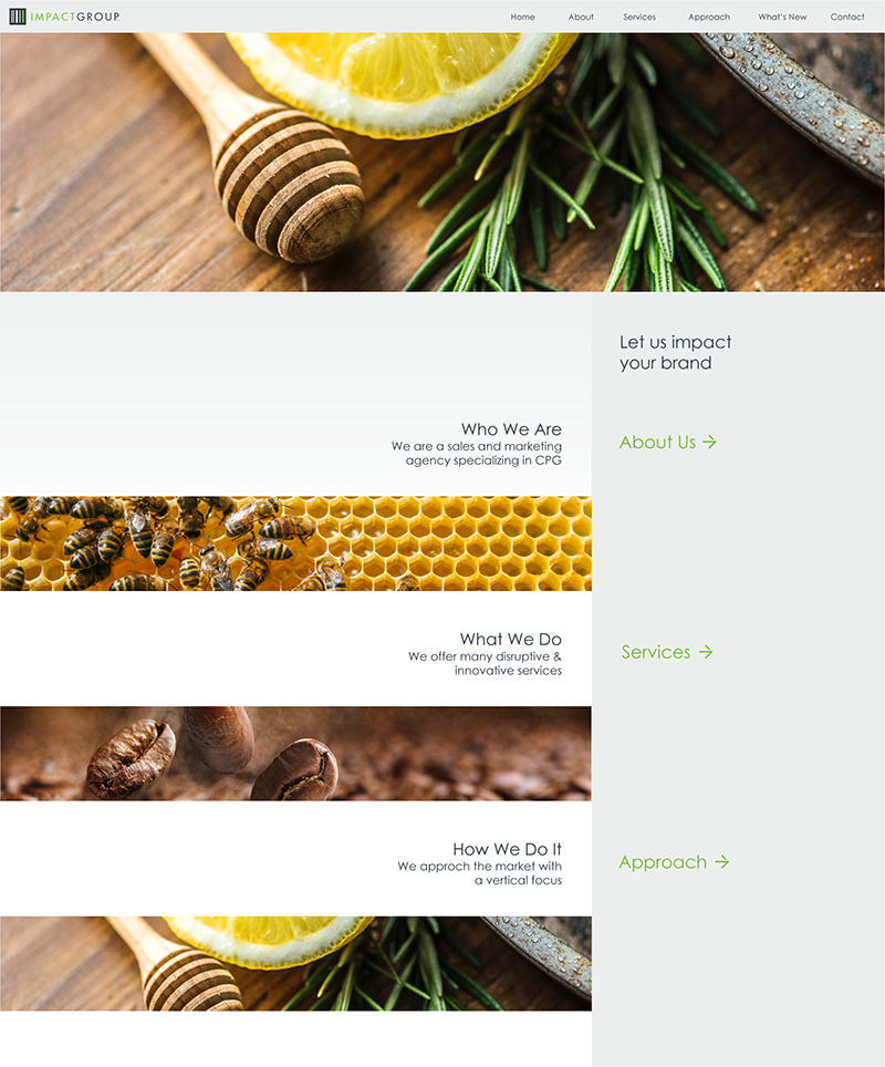
Not only were icons changed, we also explored redeveloping the website. The redesign relied less on the brand's greens and greys and instead had much more white space for the site to breathe.
